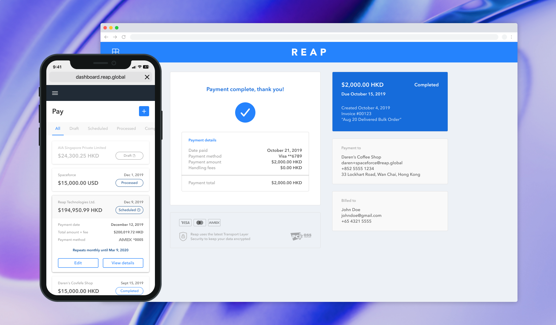
Enabling small to medium businesses to access more cash flow and simplify business payments with credit cards
Reap
6 Months
Product Designer — User research, experience design, visual design, UX strategy, prototyping, QA testing, motion design. I joined Reap in its early startup days as its first UX/UI designer on a team of 10 people. I had a hand in every aspect of the end-to-end design and worked alongside my product manager to develop Reap's design process and contribute to strategic decisions.
Reap is a fintech startup revolutionizing the way businesses manage cash flow and increase capital efficiency by leveraging credit cards to allow businesses to pay expenses and collect revenue to and from anyone, anywhere. My goal for this project/redesign was to understand customer needs and lead the design direction of the product in collaboration with my Product, Growth, and Engineering teams, including developing a design system and consolidating the payment and collection sides of Reap.

Reap is a payment technology platform that aims to help small and medium-sized businesses unlock cash flow to accelerate their growth and success. Reap can help simplify business payments and ease payment terms, whether cross-border (available in 40 currencies) or local, and provide instant credit to pay rents, salaries, invoices, taxes, vendors, and more, while allowing business owners to use their preferred credit cards to collect rewards like cash back and travel miles.
As a startup, Reap is continually aiming to attract new users and process more payments with its product offerings. But the platform was originally built for function over form, and was outdated in terms of usability, branding, modern design standards, etc., resulting in an unclear business proposition, poor impressions, and user drop-offs. And as a not-well-known business dealing with finances and payment security, it was always going to be more challenging to gain the trust of new users.
There were no security checks to sign up because we want to provide frictionless signup and get users signed up quickly, but more and more users dropped-off after each step of the payment process. Was it because they just wanted to get a look at the product? Maybe they didn't trust Reap to make a payment? Brand reputation couldn't be solved overnight, but what we could do was build brand equity through a product people want to use, and improve information and transparency. How might we better showcase how Reap works, and the benefits of using it?
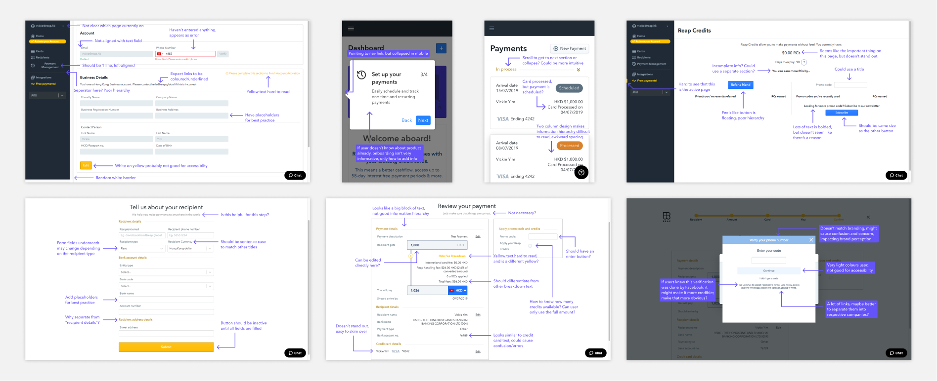
I began my research by performing a design review of the current experience on both desktop and mobile, noting down questions to discuss with my product manager, and my expected or desired behaviours. This allowed me to develop a strong understanding of the product and its benefits. I also wanted to get an idea of why users were leaving the site after creating an account. Was there not enough information on the website to explain what Reap does, and why people should use it? Or maybe it wasn't clear enough? Can we make a better first impression through onboarding?
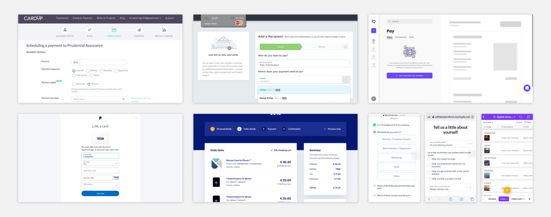
Operating in Hong Kong, Reap did not have any direct competitors, so I worked with my product manager to identify companies in our market who operate in other countries to analyze their sign up and payment processes. This gave me a sense of what our users might expect from a product similar to ours, and validated which of our designs met market standards. I also looked into onboarding experiences from notable brands to find the best ways to create a personalized experience that met our business needs.
Competitors: Plastiq (North America), CardUp (Singapore, Malaysia), Melio (USA)
Relevant inspiration: FreshBooks, Razorpay, PayPal, Amazon, Stripe
Onboarding inspiration: Airtable, HubSpot, FreshBooks, Intercom, Shopify
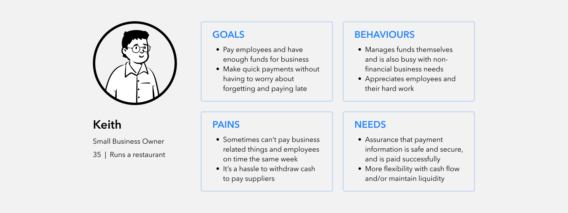
Since Reap was a new business without a large user base nor a research budget, I decided to begin my user research by interviewing people who could fit into our secondary user group: users who could use Reap for personal expenses. Though not our primary target, it gave me a starting point to assess Reap's credibility based on branding, as well as usability. I wanted to know: What makes you trust a site with personal info such as your credit card? Would you use a product like Reap? Why or why not? How would you determine what documents to upload to verify your payments?
When my product manager went out for client meetings, I would accompany him to hear from our current and target users and get a better sense of their needs and pains. Through these meetings, we were able to identify bugs and usability issues that affected the current product experience, in addition to getting ideas of what new features could help our users grow their businesses.
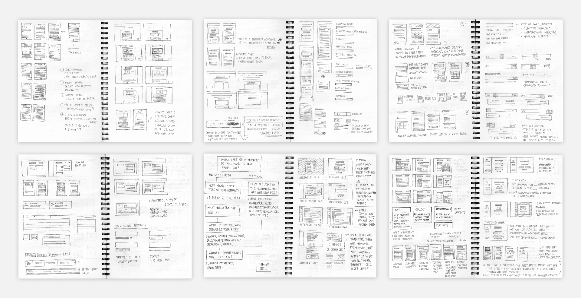
For the redesign of each new product page, I began by sketching out ideas for how to best arrange the information hierarchy, and referred to my market research to employ the best modern design practices. I would discuss my design decisions, thoughts, and questions with my product manager before moving onto wireframes and then high-fidelity mockups.
Through my user interviews, I heard concerns regarding data safety and security, particularly surrounding storing credit card information, such as whether or not credit cards should be automatically saved during the payment process. I discussed saving cards being an option with my product manager, but because this didn't align with our business goals (drive recurring use), we opted to keep things as is, and instead, adjusted the information hierarchy to make it clearer that cards were being added to the account.
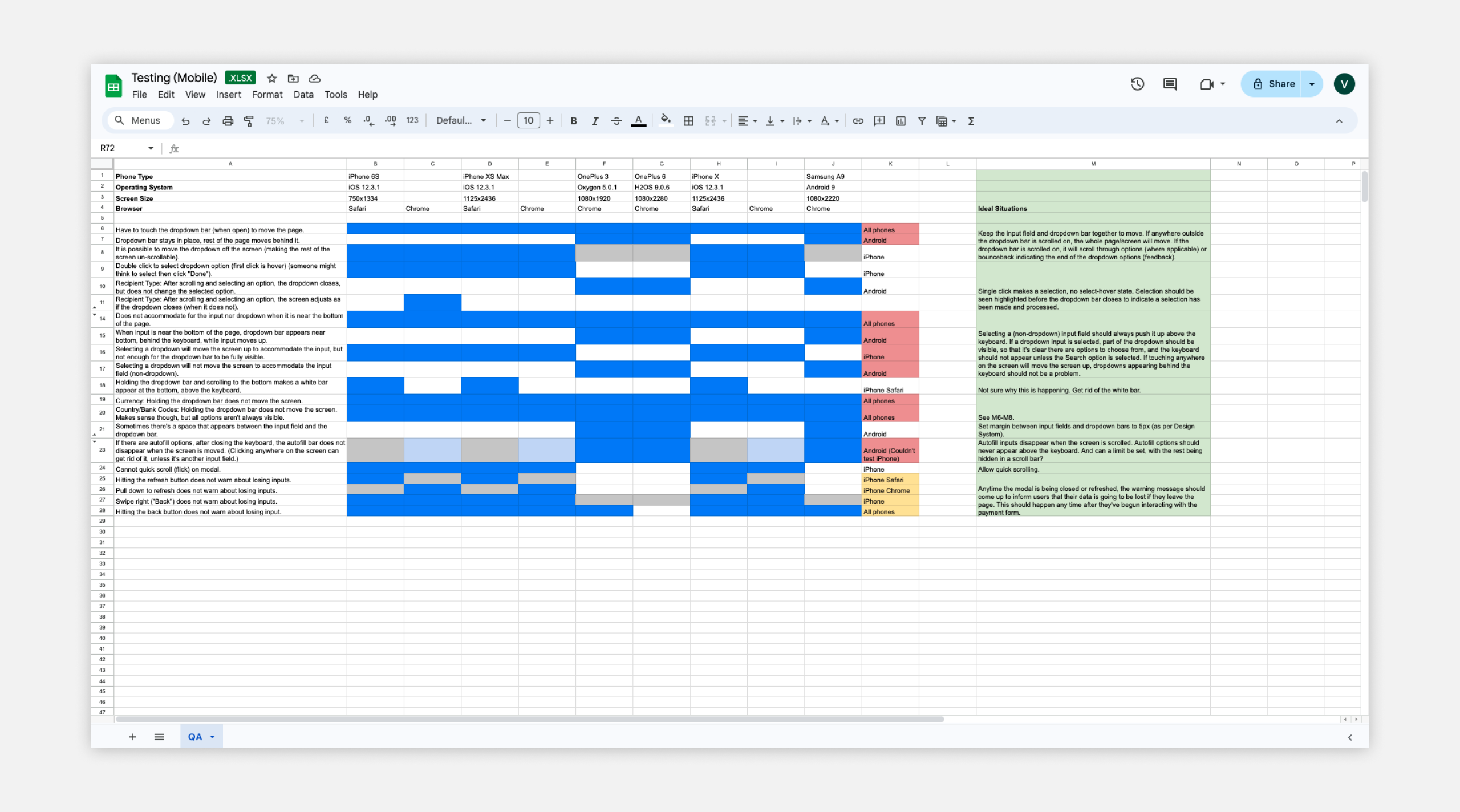
Alongside my product and engineering teams, I conducted quality assurance tests in our dev environment to ensure our product met usability standards without errors or difficulties. Because our web platform was designed with a mobile-first approach, which has more restrictions, I made sure our mobile testing was very thorough, testing across different device sizes, operating systems, and browsers.
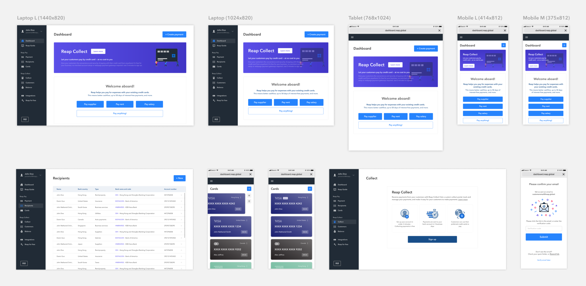
The redesigned Reap platform enhances the company's brand perception through improved usability and consistent designs, and is made more accessible through a more responsive and user-friendly site. I took into consideration elements such as colour contrast, minimum target touch size, and each page's information hierarchy to create a modern site to boost Reap's credibility.
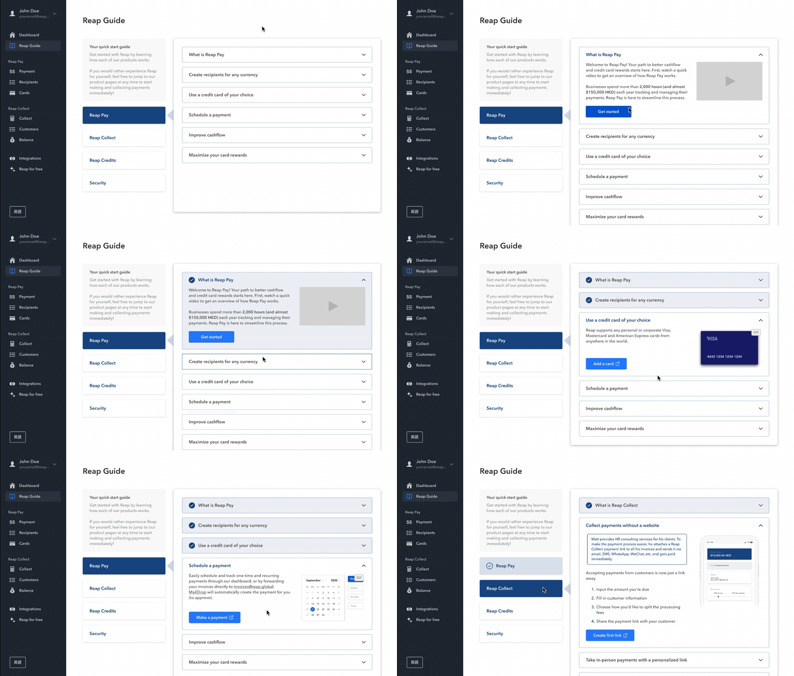
While it's not expected that every new user has an immediate payment to make, the majority of these users dropped-off just before entering their personal financial information. From this, we inferred that our users wanted to gain first-hand knowledge of how Reap worked, and if it was a right fit for their business.
We leveraged the fact that most new users looked through all the onboarding steps to develop the Reap Guide, a comprehensive onboarding guide that details how Reap can be used, and explains the security measures in place to keep user information safe. Unlike the previous 4-step onboarding, the Reap Guide takes users through each step of the payment process, collect process, etc., and can be referenced again anytime by new and returning users through the navigation bar.
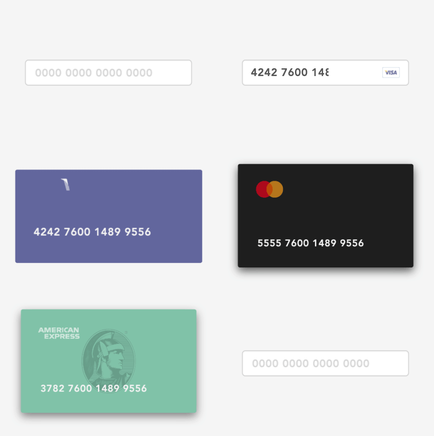
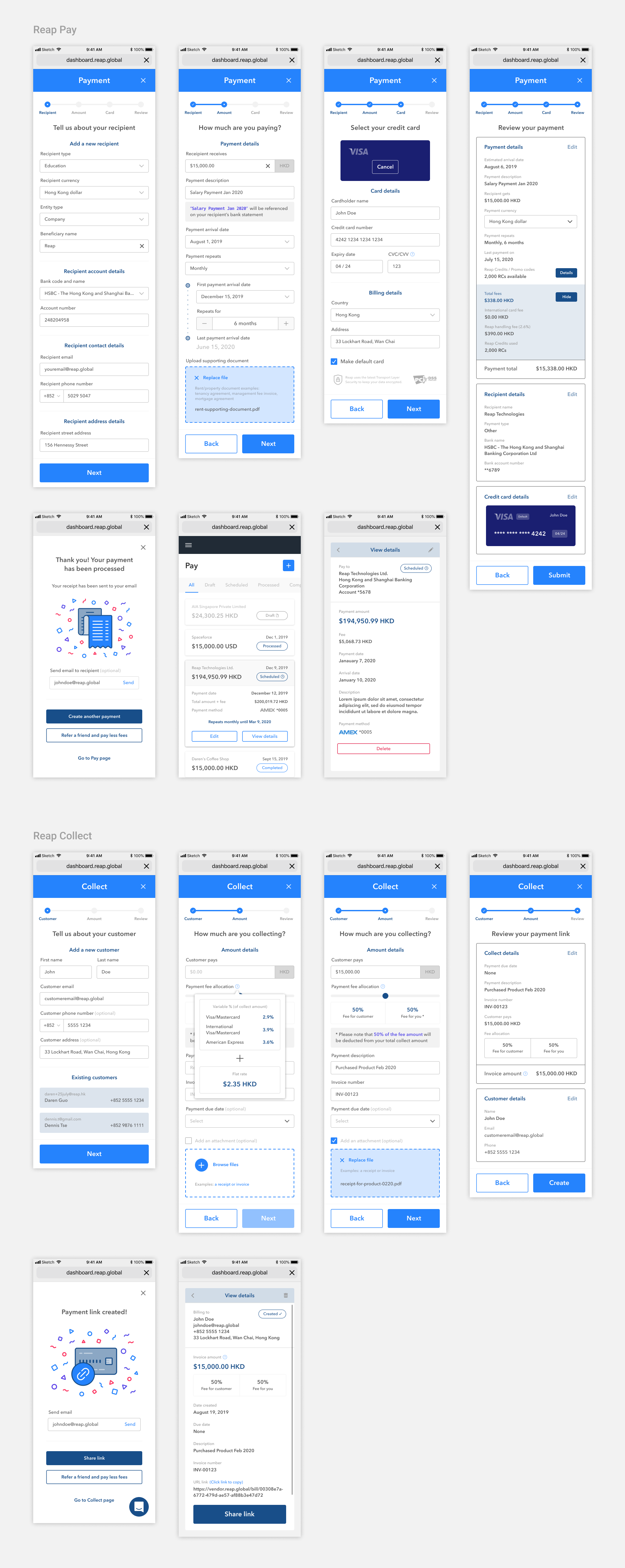
To help users quickly navigate the multi-page payment form, I employed best practices including: conditional logic fields to only show the relevant fields for beneficiary types, in-line validation to speed up error correction, field focus on mobile to prevent the keyboard from covering input fields, adding visual components to highlight important inputs, and improved information hierarchy.
We also used this redesign to address our users concerns, such as: including helper text to indicate what types of documents to upload with their payment, and allowing users to clear their default card selection to give them the control of selecting which card to pay with each time.
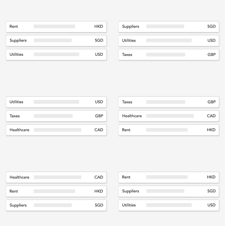
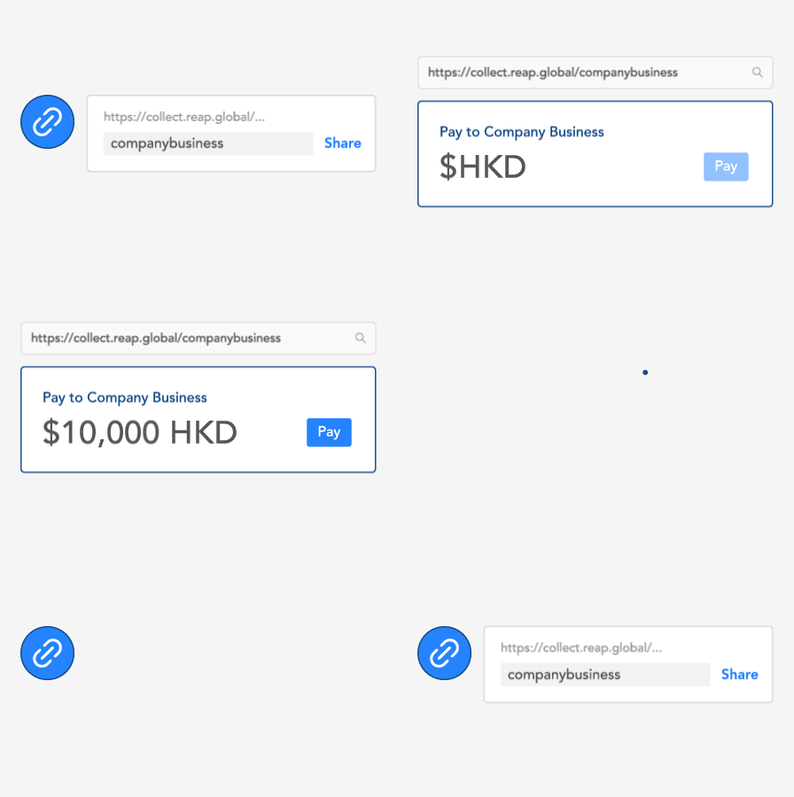
I worked closely with my product manager to develop a component library inline with the new Reap brand guidelines. This helped create consistency in our designs, improve accessibility, and reduce development time in the redesign of the entire platform. Aligning to these new guidelines also helped our strengthen our brand recognition in our marketing initiatives in advertisements and at conferences.
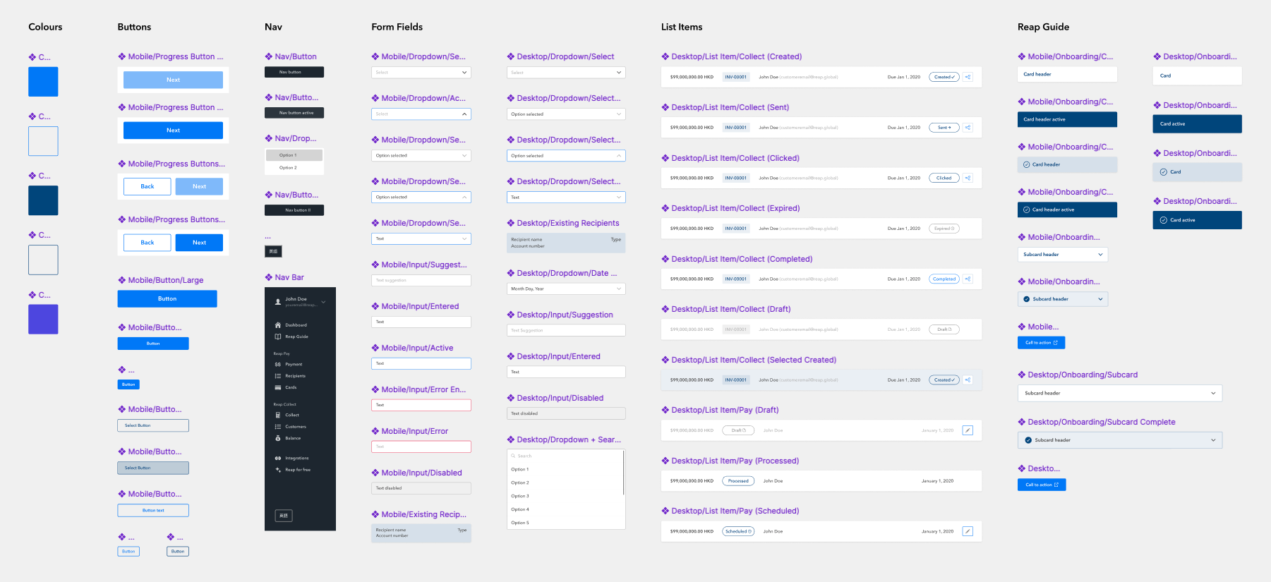
In my time with Reap, I delivered hundreds of mockups through the redesign of every page of the platform, in addition to strategizing and implementing new pages like the Reap Guide, and integrating the collect side of Reap into the main product, making it available to all end users. The redesign was well received by our core user base, like our early adopters, who were happy with the improved usability and modern design, and the ability to pay and collect revenue through one single platform.
Through my first experience working with managers and engineers, I learned a lot about the product and development lifecycle. Being able to iterate and flesh out design ideas gave me the opportunity to grow and learn from my mistakes. I learned to lean more on researching design resources and best practices to be able to work not just faster, but smarter, and push out better work. Reflecting on my work, I think there were better design thinking questions I could have asked, and more details I could have added to provide context earlier upfront for a smoother user experience. Near the end of my time with Reap, I began to grasp the amount of work it takes to build a proper design system, which pushed me to start learning more about design systems to improve my knowledge for my future design work.